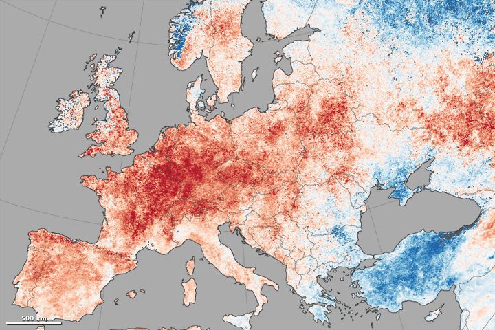
A map shows daytime land-surface temperature anomalies in Europe from June 30-July 9, 2015, compared to the 2001“2010 average for the same period. Shades of red depict areas where the land surface was hotter than the long-term average; areas in blue were below average.