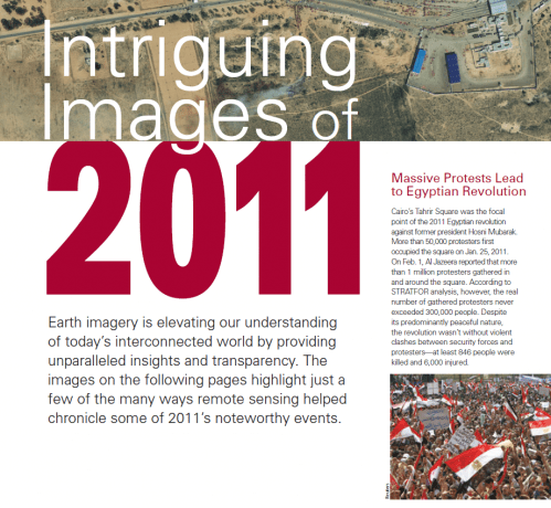
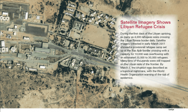
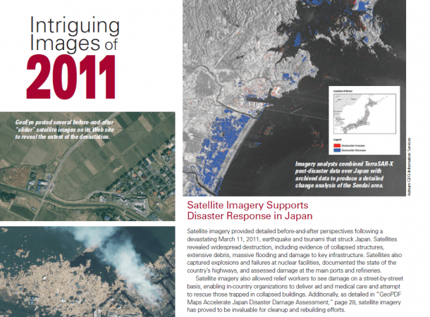
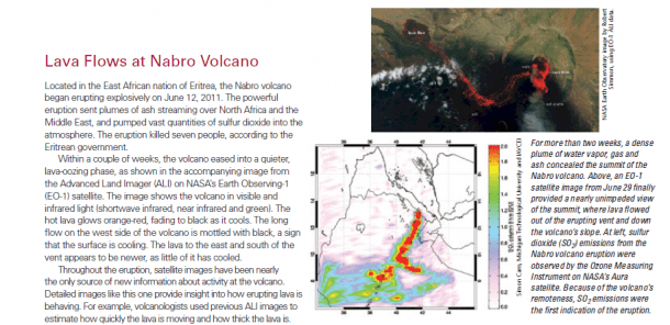
Earth imagery is elevating our understanding of today's interconnected world by providing unparalleled insights and transparency. The images on the following pages highlight just a few of the many ways remote sensing helped chronicle some of 2011's noteworthy events.
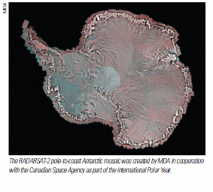 Antarctic Mosaic Comprises More Than 3,000 RADARSAT-2 Images
MDAInformation Systems Group's new image of Antarctica, developed in coordination with the Canadian Space Agency for the International Polar Year (2007-08), is a unique compilation of more than 3,150 RADARSAT-2 images that comprise a single pole-to-coast map covering all of Antarctica. The mosaic provides a detailed representation of the Antarctic ice sheet, showing subtle topographic features from the South Pole to the Antarctic coastline.
Used in conjunction with the RADARSAT-1 Antarctic mosaic produced in 1997 by researchers at the Byrd Polar Research Center at The Ohio State University, along with Vexcel, the Alaska SAR Facility, the Canadian Space Agency and NASA, the RADARSAT-2 Antarctic mosaic provides a unique view of the approximately decadal change in the Antarctic ice sheets. The image provides insight into the current condition of the Antarctic ice sheets, as well as the nature and rate of change in the Antarctic environment.
In addition, the image provides a useful map to support operations needing detailed information to understand the surface and sub-surface features of the Antarctic ice. The knowledge gained from this important scientific mission will enhance the collective information being compiled worldwide on the Antarctic, providing a deeper understanding of the relationship between ice and climate change.
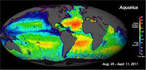 NASA's Salt of the Earth Aquarius Reveals First Map
NASA's new Aquarius satellite produced its first global map of the salinity, or saltiness, of Earth's ocean surface, providing an early glimpse of the mission's anticipated discoveries. Its rich tapestry of global salinity patterns demonstrates Aquarius' ability to resolve large-scale salinity distribution features clearly and with sharp contrast.
The new map is a composite of the first two and a half weeks of data after Aquarius became operational onAug. 25, 2011. The numerical values represent salt concentration in parts per thousand (grams of salt per kilogram of sea water). Yellow and red colors represent areas of higher salinity, with blues and purples indicating areas of lower salinity. Areas colored black are gaps in the data. The average salinity on the map is about 35.
The map reveals predominantly well-known ocean salinity features, such as higher salinity in the subtropics, higher average salinity in the Atlantic Ocean compared with the Pacific Ocean and Indian Ocean, and lower salinity in rainy belts near the equator, in the northernmost Pacific Ocean and elsewhere. These features are related to large-scale patterns of rainfall and evaporation over the ocean, river outflow and ocean circulation. Aquarius will monitor how these features change over time and study their link to climate and weather variations.

