By Robert Simmon, NASA Goddard Space Flight Center (www.nasa.gov/goddard), Greenbelt, Md.
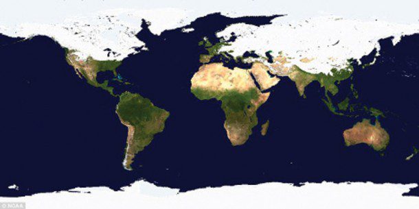
hen it comes to misinterpreting a satellite image or map, there are many ways the media and other organizations can get it wrong. For example, consider this recent headline and image from the U.K.'s Daily Mail Online:
World of two halves! Map shows most of Northern Hemisphere is covered in snow and ice.
As far as I could tell, the imagery was from late January to early February. Most of the Northern Hemisphere covered in snow and ice?
At first glance it's a plausible claim, but here's the problem: The map is in a cylindrical equirectangular projection, which distorts relative areas. Regions north and south of the equator appear larger on the map than they are in reality”the higher the latitude, the larger the exaggeration. As a result, a much higher percentage of Earth's surface appears to be covered in snow or ice than really is. As far as I can tell, the snow and ice map came from the National Oceanic and Atmospheric Administration's Environmental Visualization Laboratory.
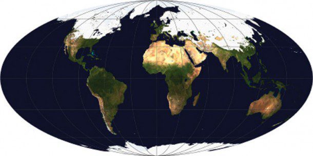
After transforming the map to an equal-area projection (in this case Mollweide, which also preserves straight lines of latitude), it's obvious that most of the Northern Hemisphere remains snow and ice free”even in mid-winter:
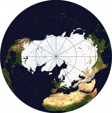
A map showing just the Northern Hemisphere (azimuthal equal area, centered on the North Pole) makes it even more clear:
For maps of measured quantities on Earth's surface (like snow, temperature, rainfall or vegetation) it's important to choose a projection carefully to minimize misunderstandings of the underlying data. It's far too easy for a map to exaggerate one area at the expense of another. It's also important to keep projections consistent when displaying a time series or comparing datasets with one another.
Despite the major flaw of not being equal area, a cylindrical equirectangular projection, which goes by many other names, is useful. It's the standard projection for importing into a 3-D program and wrapping around a sphere, and it's easy to define the corner points and scale for import into software to transform to other map projections.
Here I performed all the reprojections with the excellent tool G.Projector, which is a cross-platform application that can transform an equirectangular map image into one of more than 90 global and regional map projections. Longitude-latitude gridlines and continental outlines may be drawn on the map, and the resulting image may be saved to disk in a variety of graphic formats (see www.giss.nasa.gov/tools/gprojector).
For more information about map projections, see the U.S. Geological Survey (USGS) page Map Projections (http://egsc.usgs.gov/isb/pubs/MapProjections/projections.html), the National Atlas' Map Projections: From Spherical Earth to Flat Map (www.nationalatlas.gov/articles/mapping/a_projections.html) and the Wolfram Mathworld Map Projection site (http://mathworld.wolfram.com/MapProjection.html). For an in-depth discussion, read Map Projections”A Working Manual, which is available from USGS at http://pubs.er.usgs.gov/djvu/PP/PP_1395.pdf.


